How Sleekplan’s Satisfaction Module Works: They Were Right and We Were Wrong
Sleekplan has an NPS and CSAT feature called Satisfaction. We were about to build score-over-time on our own surveys, so we spent an evening inside a live workspace looking at how somebody who had already shipped it lays the page out.
They were right and we were wrong, and that is most of what I have to report.
Our survey score panel took every response a form had ever collected and folded it into one all-time number. buildFormSurveyResult ran findMany({ where: { formId }, select: { answers: true } }). It did not select createdAt at all. So a team that fixed the thing everybody was complaining about and lifted their CSAT had no way to see that it lifted. Their score was anchored by their worst month forever. Sleekplan’s page opens on a line chart.
Two things to know before the screenshots. Our workspace was on a Business (Legacy) trial at $0 a month, not the free tier, so we hit no paywalls and cannot report free-tier gating from what we clicked. And the workspace had zero responses, so every chart below renders its shape with 0s in it. Shape was what we came for.
The first thing on the page is a trend
/nps is a full analytics page in the left nav under Analytics, next to Topics and CSAT. Not a stats tab hanging off a campaign. Top to bottom it goes: one written sentence, five tiles, the Score trend chart, the promoter/passive/detractor composition, then the verbatims with a band filter across All, Promoters, Passives and Detractors.
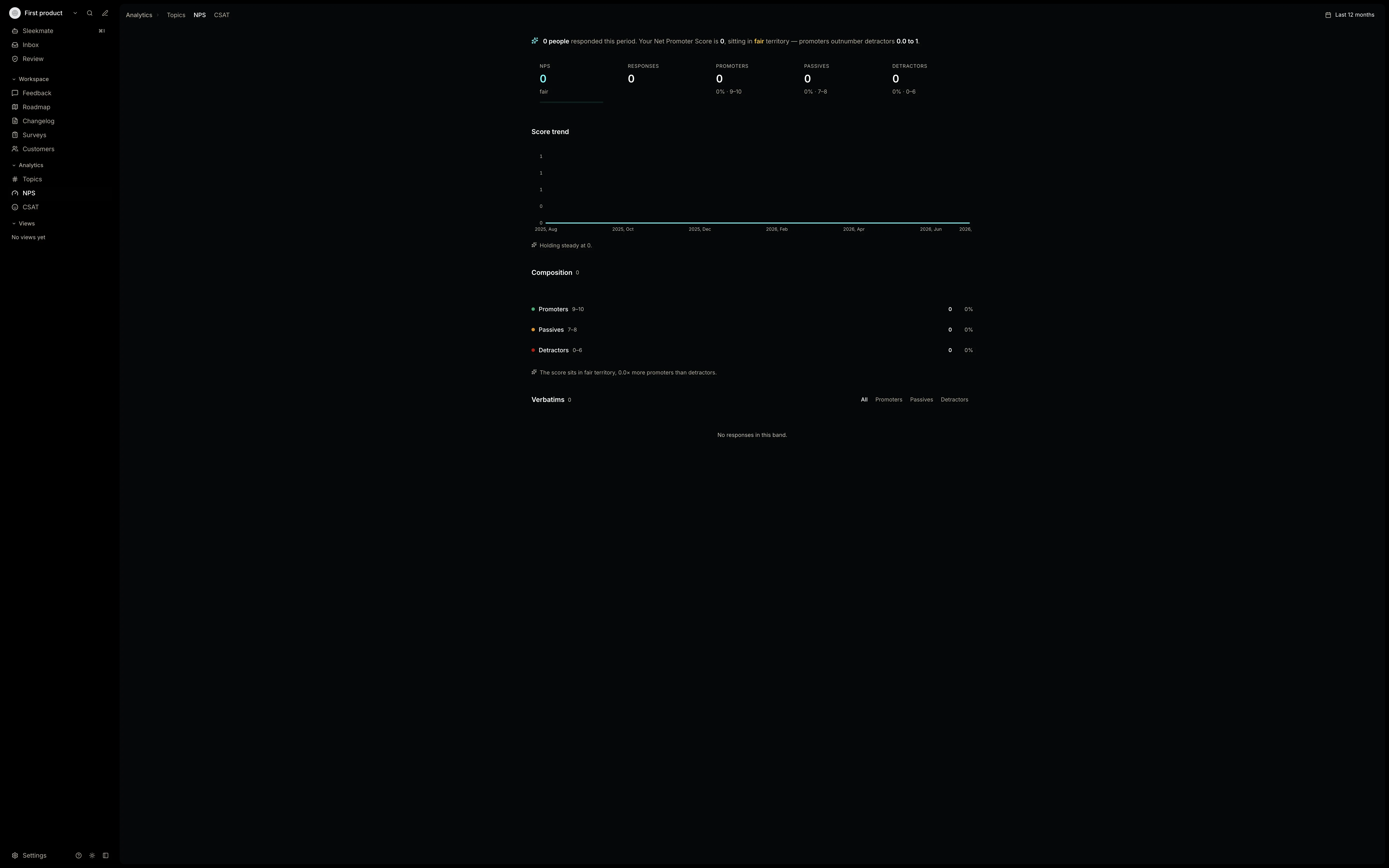
Most tools in this category put the number on the page and the trend behind an analytics upgrade. Sleekplan treats the number as a summary of a time series and shows you the series. An NPS of 31 on its own tells you almost nothing. If it was 12 in June, now you have something.
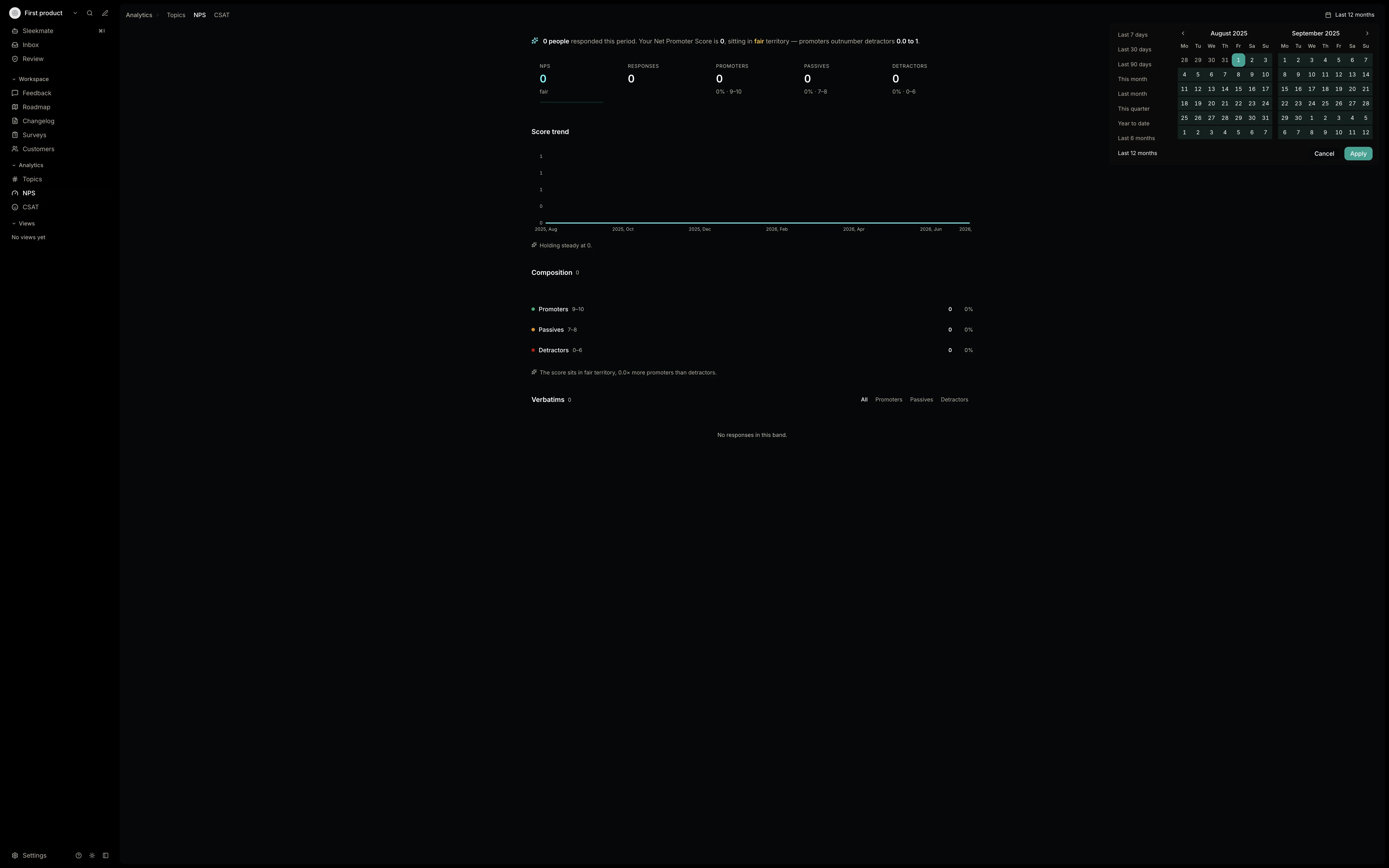
The period control is one button in the top right reading “Last 12 months”. Open it and you get a two-month calendar and nine presets: Last 7 days, Last 30 days, Last 90 days, This month, Last month, This quarter, Year to date, Last 6 months, Last 12 months, plus a custom range with Cancel and Apply.
Somebody wrote a sentence under every chart
This is the part I liked most, and it is the cheapest thing on the page to build. Under the Score trend: “Holding steady at 0.” Under the composition: “The score sits in fair territory, 0.0× more promoters than detractors.” On the CSAT page, under the reaction mix: “‘Angry’ leads with 0% of reactions.” All of those render on a workspace with nothing in it. Somebody went and wrote the empty state too.
And under the big NPS tile, a single word: fair. Nobody running their first NPS knows whether 31 is a good result. That word answers it before you go and google it. We took both of these the same night.
The best-engineered screen is the one about timing
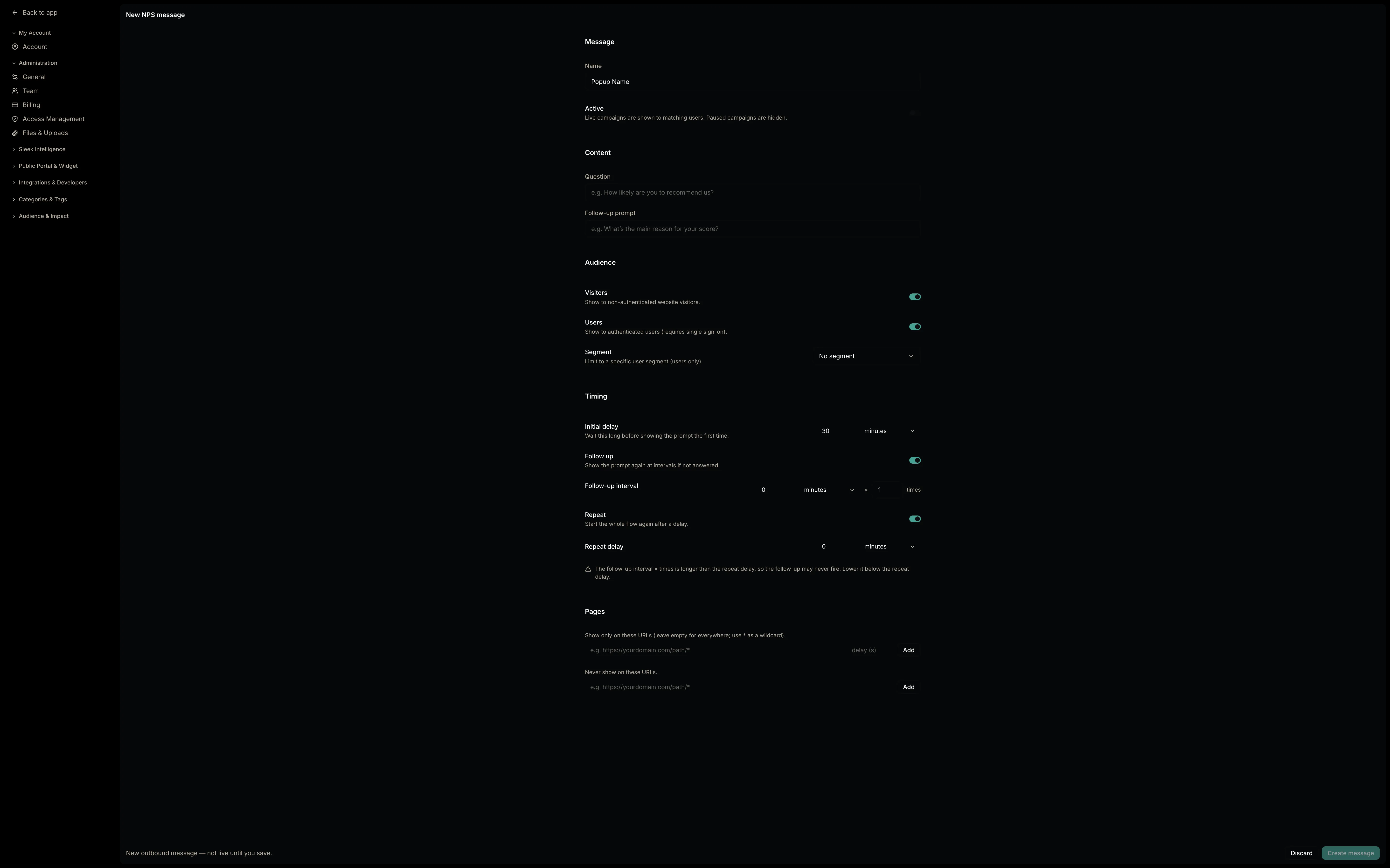
NPS and CSAT are not tabs in the Sleekplan widget. They are delivered as a timed popup from Settings → Public Portal & Widget → Outbound, which is where the audience, timing and page rules live for all five prompt types. The NPS builder is one scrolling form: Message, Content, Audience, Timing, Pages.
Timing is four knobs.
- Initial delay, in minutes, defaulting to 30. “Wait this long before showing the prompt the first time.”
- Follow up, a switch that reveals an interval in minutes × a number of times. “Show the prompt again at intervals if not answered.”
- Repeat, another switch with its own delay. “Start the whole flow again after a delay.”
- Pages, an allowlist with a per-URL delay in seconds and a blocklist, both taking
*as a wildcard.
Then turn on both switches and this appears: “The follow-up interval × times is longer than the repeat delay, so the follow-up may never fire. Lower it below the repeat delay.” Somebody sat down, worked out how those two knobs fight each other, and then wrote the warning. I have not seen that anywhere else in this category.
We did not build any of this. Usero surveys still publish to a public link and there is no in-app popup to time, so there is nothing yet for a delay to delay. When we do build it, this is the model we will copy, warning included.
Where the score stops
So where does a low score go from there? A detractor writes something painful, and it arrives in the Verbatims list on the analytics page. That is where it stays. It is not a post on the board, it collects no votes, and I could find no convert-to-feedback action anywhere on it. Sleekplan’s Customers table does carry a CSAT and an NPS column per person next to Posts, Votes and Comments, so a score is an attribute of somebody you can also read the history of, which is a nice touch. Our workspace had one member and no responses, so all I saw were dashes.
The rest of Sleekplan is a machine for turning what a user said into something you ship. Satisfaction sits beside it. Their own docs mention a Slack alert when a detractor responds, which we did not test and which is a notification either way.
What it costs
Careful here, because we cannot report this from experience. Our trial handed us everything, so the gating below comes from Sleekplan’s published pricing rather than from a wall we hit. Per that page: the Indie free tier gets no CSAT and no NPS at all, Starter unlocks both, and Business adds multi-step surveys, topic analytics and segmentation. Delivery is metered by popup views, 500 a month on Indie, 5,000 on Starter, 10,000 plus add-ons on Business.
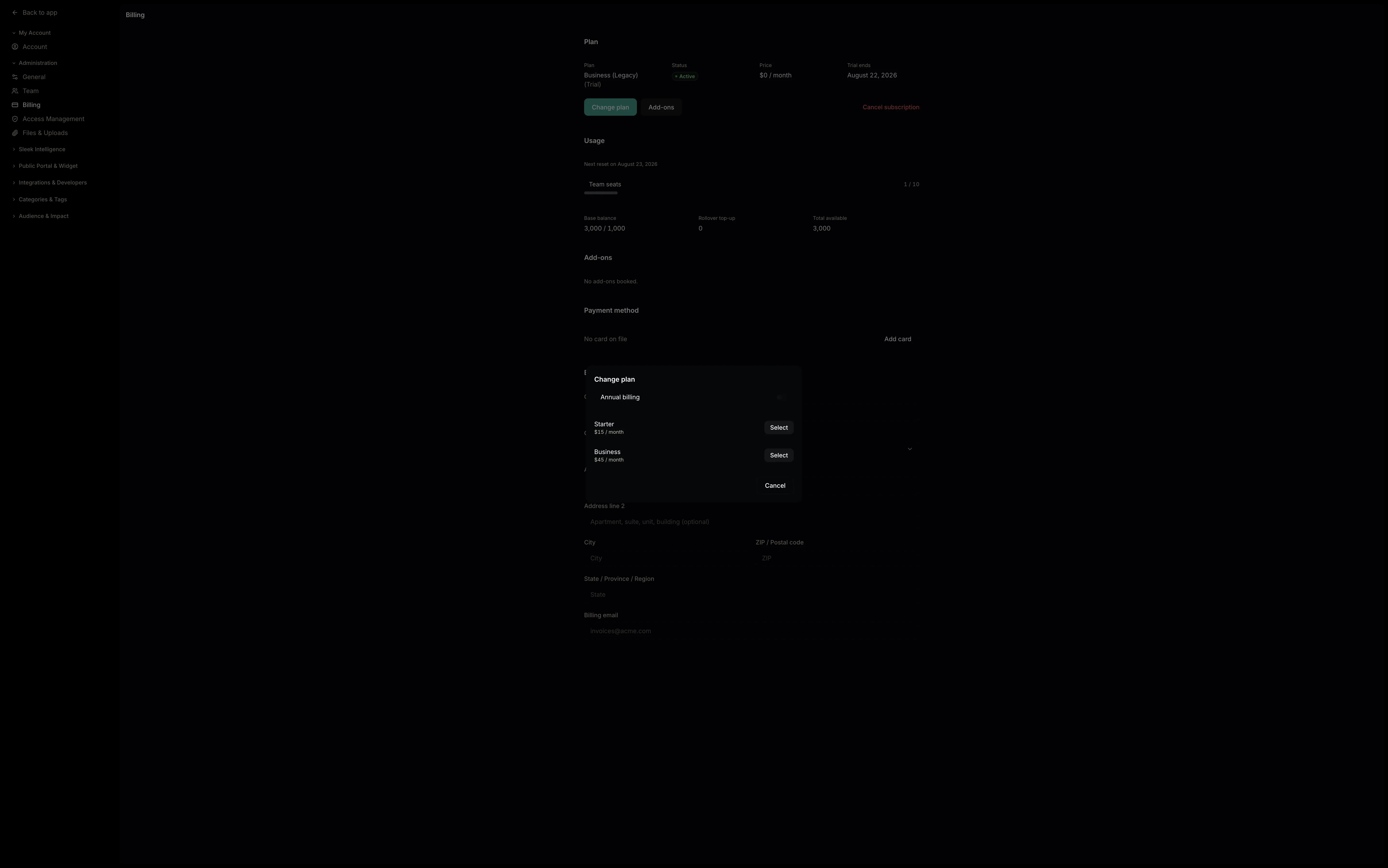
What we did see is the in-product tier chooser, which offered two options: Starter at $15 a month and Business at $45. The lower numbers quoted on the website are the annual-billing prices.
Metering on popup views is an honest unit. It bills the thing that costs them and it scales with your traffic instead of your headcount. The side effect is that an aggressive repeat cadence spends your own quota on people who already ignored you once.
How we built ours
The fix on our side was small, which is the annoying part about having got it wrong. The createdAt we needed was already on the response row. No schema change, no migration, no new table. Add it to the select, bucket the responses, recompute the metric per bucket, and put a range picker in charge of the window.
Four ranges: 7d, 30d, 90d and All, defaulting to 30 days. The bucket follows the span, so a week is drawn by day, a month or a quarter by week, and anything longer by month. Empty buckets keep their place on the axis with no point drawn on them. Drop the quiet weeks and a two-month gap looks like a week; plot a zero and it looks like everybody suddenly hated you.
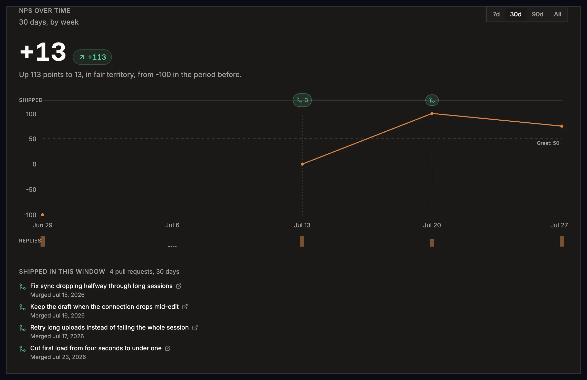
The sentence is theirs and we took it without much soul-searching. “Up 113 points to 13, in fair territory, from -100 in the period before.” “Holding steady at 42.” So is the band word: great, good, fair or poor, with the top band’s floor set to the same target the template’s benchmark line already quoted, so the word and the prose cannot disagree.
One thing we added that they do not have. A period needs 3 scoreable responses on each side before we will quote a change at all. Below that the chip says “No comparison yet” and the panel explains itself, because a delta drawn from two answers is one person’s mood on a Tuesday.
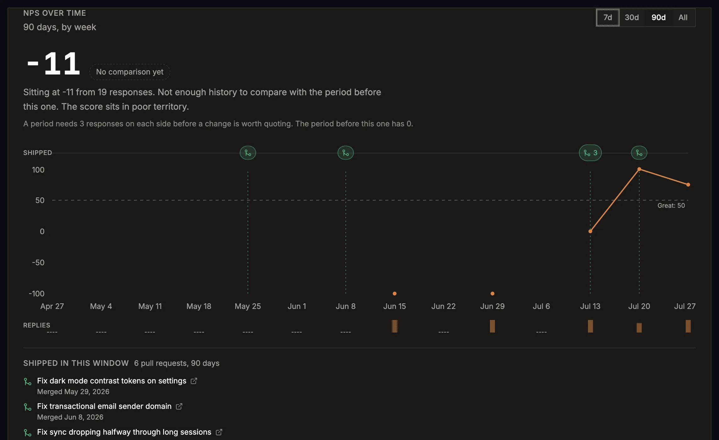
Then the part they cannot do. A survey answer in Usero is already a feedback item with source: ‘survey’. It clusters with the widget reports and the forwarded emails saying the same thing, and a clustered item carries a Create Pull Request button. So we know when an AI-authored PR merged, and we draw those on the trend line.
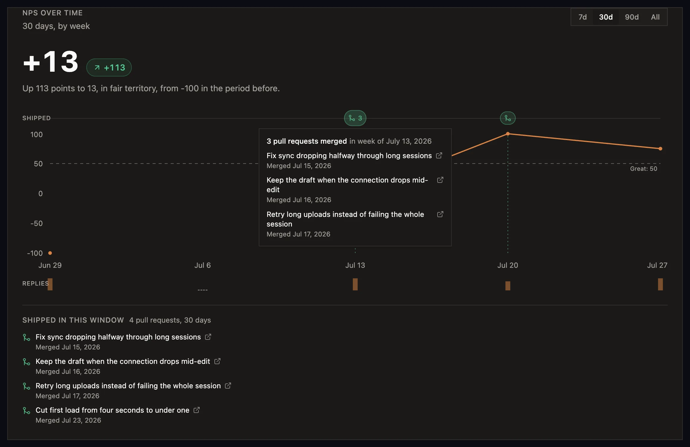
That is the whole reason we wanted the chart. People said something, we shipped four things, here is the score afterwards. A survey tool can draw the first and the third of those.
What we did not build
The timing controls, which are the best part of their module, and which we spent four paragraphs admiring. Per-person score columns on the customer record. Export. And the roll-up: our trend lives on one form’s responses tab, so a customer running an NPS on the web and another one in-app has two charts and no total, where Sleekplan’s /nps is a product-level page. That one is next.
What we took away
Lead with the trend. Write the sentence under the chart. Put the word next to the score so a first-timer knows whether to be pleased. All three are Sleekplan’s and all three were in our product by the end of the night, which is the nicest thing I can say about somebody else’s design work.
The trend is live on usero.io now. If you want to poke at the survey it hangs off, sign up free and pick the NPS template, or read the Featurebase surveys teardown for where that half came from.
Frequently Asked Questions
What is Sleekplan’s Satisfaction module?
It is the NPS and CSAT half of Sleekplan. Three modules and a delivery layer: NPS with its own analytics page at /nps, Satisfaction (CSAT) with its own page at /csat, multi-step Surveys that can also carry NPS and CSAT as question types, and Outbound messages, where the audience, timing and page rules for all of them live.
Does Sleekplan show NPS over time?
Yes, and it is the first thing on the page. /nps opens on a Score trend line chart with a period control in the top right offering Last 7 days, Last 30 days, Last 90 days, This month, Last month, This quarter, Year to date, Last 6 months, Last 12 months, and a custom range on a two-month calendar. The single score is presented as the summary of a time series rather than the whole answer.
Is NPS free on Sleekplan?
No. Per Sleekplan’s published pricing, the Indie free tier includes no CSAT and no NPS; Starter unlocks both, and Business adds multi-step surveys, topic analytics and segmentation. We could not confirm the gating by hitting it, because our workspace was on a Business (Legacy) trial at $0 per month, so nothing was locked. The in-product tier chooser offered Starter at $15 a month and Business at $45.
Can a Sleekplan detractor comment become a roadmap item?
We found no path for it. The verbatim sits in a banded list on the analytics page with a filter across All, Promoters, Passives and Detractors. It does not become a board post, it collects no votes, it carries no status, and there is no convert-to-feedback action. Sleekplan documents a Slack alert when a detractor responds, which is a notification rather than a next step.
How does Usero’s survey score over time work?
The responses tab of a survey form carries an NPS over time panel with 7d, 30d, 90d and All ranges, bucketed by day, week or month depending on the span. Empty buckets stay on the axis with no point drawn. Under the chart sits one sentence describing the movement, and a period needs at least 3 scoreable responses on each side before we will quote a change. Merged AI-authored pull requests are drawn on the timeline as markers, with the list of what shipped underneath.
Continue reading
How Canny’s Changelog Works: It Knows Who Asked, and It Never Tells Them
A hands-on teardown of Canny’s changelog from inside a live free-plan workspace: the three-pane editor with a live preview, the linked-posts typeahead that carries vote counts, the publish confirm with no notify option, the Pro-gated subscriber list, and the passive banner the requester has to go looking for. Plus the requester notifications, recipient preview, markdown fix and RSS feed we built the same night.
8 min read
How Featurebase In-App Surveys Work: The Screen We Copied, and the One We Did Not
A hands-on teardown of Featurebase in-app surveys from inside a live workspace: two survey systems in one product, a template gallery where every card is a live render, benchmark lines on the templates, the Featurebase Posts poll type, and what the Free plan stops you doing. Plus how we built Usero surveys on Forms so answers land in the feedback inbox and can become a pull request.
8 min read
How Savio Pulls Feedback Out of Intercom, Zendesk, and Help Scout
We spent an evening inside a live Savio trial studying how it pipes support conversations into a feedback inbox: the OAuth handoff, the single feedback tag, the Zendesk subdomain wrinkle, the note-as-feedback trick, and the pricing tier that charges Zendesk shops double. The best decision in the feature looks like a limitation, and it exposed something broken on our side.
8 min read
Build a feedback loop your team actually uses
Usero collects, clusters, and turns user feedback into shipped fixes.
Get started free